It’s understandable if you’re a little hazy on the plot of The Dying And The Dead, Jonathan Hickman and Ryan Bodenheim’s Image series, which is finally set to release its fourth issue on Wednesday. After all, the third issue was released in the heady days of September 2015.
Even by the notoriously perfectionist standards of Hickman, it’s been a long wait between issues. For the host of fans that follow his comics like acolytes, they may have forgotten the intricacies of a series full of secret histories, esoteric cults, ancient pre-human races, and a host of elderly men hoping to descend into the darkness one last time.
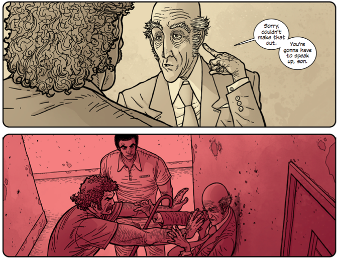
Broadly speaking, The Dying And The Dead is an homage to Indiana Jones by way of The Expendables. In 1969, ex-soldier Edward Canning watches helplessly as his wife succumbs to cancer. Afterwards, he accepts an offer from the Bodari, an ancient society who live in a mysterious underground metropolis known as The City. They task him to steal an ancient artifact called the Bah Al’ Sharur, a mystical hammer that can be used to slay the normally immortal Bodari.
Having dealt with the duplicitous Bodari before, Canning recruits his team of academics and veterans, all dealing with the weathers of age, to steal the artifact, one they themselves once shattered, from a German cult, now led by Hitler’s ex-bodyguard.
It’s a high-concept comic, where the premise is slowly doled out over the first three issues. Longtime fans of Hickman’s work, however, are sure to notice some of his favorite themes and ideas permeating the book. Even recent converts could have plenty of questions about the deliberate use of a washed-out, extremely limited color palette or the often opaque way in which exposition is delivered.
Let’s start with the visuals first. Bodenheim has a slightly exaggerated style that’s sharpened by his heavy inking. His figures and faces most resemble indie cartoonists like Daniel Clowes, Charles Burns, and the late Steve Dillon and those features are accentuated by very dark inking.
That art really pops, though, with the aforementioned color. Michael Garland is the colorist here and his work should look familiar to longtime Hickman readers, as his colors have graced everything from Secret, to The Manhattan Projects and The Black Monday Murders. His work has also shown up recently in a host of Marvel’s comics, namely the recent X-Men relaunch. With Hickman, Garland’s colors have tended towards the flatter but it’s generally a symbolic decision. The Dying And The Dead is no exception.
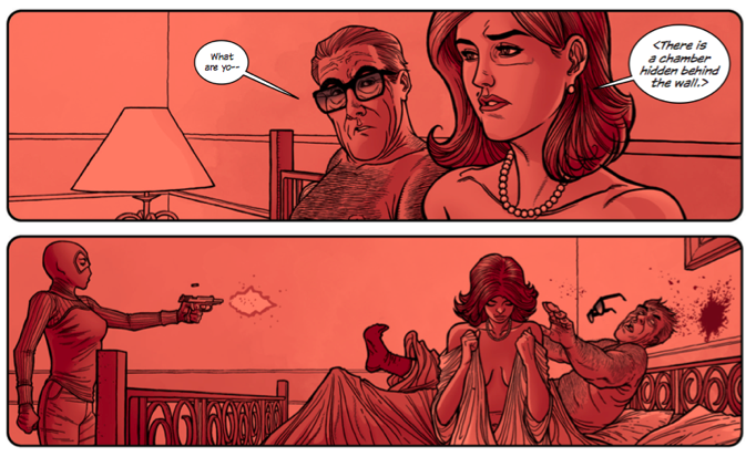
Like The Manhattan Projects, The Dying and the Dead uses color to represent an absolute. Although what the dominant colors, red, blue and yellow, represent isn’t as clear as it is in the earlier series. Readers first see the all consuming red in the debut issue, as an old man is betrayed by his new wife and executed shortly before she meets the same fate. A soft blue appears as she gives his attackers a box, containing a piece of the Bah Al’ Sharur.
It’s a moment that can only be interpreted after more exposition has been unspooled and how it relates to the series’ central themes of choice.
The world of The Dying and the Dead is built on the mythological conception of choice, where every decision matters and rules must be followed or devastating consequences must be reckoned with. The rules of The City evoke myths like Persephone’s imprisonment in Hades for eating a pomegranate seed, along with Eve’s decision to eat from the forbidden tree in Eden, and the classic Faustian bargain for power with beings outside of mortal comprehension. In all of those myths, transgression is met with an absolute response and it sets the tone for all of what we see, both from the residents of the city and the choice they offer Edward.
The question of choice is a constant refrain in the first issue. A courier of The City wonders aloud if Edward’s wife’s disease is a result of choice. The Bishop of The City emphasizes that Edward cannot simply save his love, he has to make a choice to work with the Bodari.
The courier’s last words to Edward as he enters the city to hear the Bodari’s offer neatly sums up how Hickman’s script emphasizes the clear lines between indecision and choice when he says, “I would wish you luck but this has nothing to do with that. You’ll find no good fortune here. Only life, only death, so choose well.”
Let’s take those themes back to the first issue’s opening pages. The clear opposite points, with no middle ground, choice and indecision, blue and red, are the dominant themes, visually and metaphorically.
Amistad Osiris is executed in vibrant reds as Anne struggles with her decision of whether to complete the betrayal in soft blues before she ultimately gives up the artifact to her doppelgänger. Her subsequent execution, as well as her realization that things could only end one way, is rendered in the same crimson as the death of her husband.
That death is followed by the only appearance of yellow as a dominant color in the issue, as the doppelgängers assemble to present a piece of the Bah Al’ Sharur to their master, reminding readers that some things are still unknowable.
Understanding the way theme is communicated visually and metaphorically is the key to analyzing the way small moments lead to unescapable consequences in The Dying And The Dead. The decision to wed the book’s central themes so powerfully to its dominant visual motifs makes for a comic distinctly different from the rest of Hickman’s oeuvre. It’s one that feels as if it has a more clear moral center than so many of the writer’s other pieces.
As the series begins to move forward again, after years off store shelves, considering the consequences of choices is the most important thing a mindful reader can do to truly get the most out of Hickman and Bodenheim’s nearly forgotten series.