 Author: Robert Kirkman
Artist: Lorenzo de Felici
Colorist: Annalisa Leoni
Letterer: Rus Wooton
Release Date: March 7, 2018
Publisher: Skybound
Genre(s): Sci-Fi
Review Spoilers: Mild
Ten years ago, 300,000 people from Philadelphia vanished into Oblivion. For years, the government made efforts to rescue the lost, but eventually, they ceased their efforts. Years later, Nathan Cole is a one-man rescue effort, along with his ragtag group of supporters to ease the transition. They were once a government-funded operation, but funds dried up and Nathan is left relying on faulty equipment and good luck to get him into and out of Oblivion. Yet he dutifully continues to make return trips, risking his own life, to save other people… and search for his brother.
There are intriguing elements to this story: the exploration of the aftermath of a large-scale traumatic event, possible PTSD in some characters, and a government that simply wants to move on from it all. However, in another sense, this first issue feels very safe and straightforward – the hero, the world, and the twist are all neatly packaged for consumption.
Nathan is obviously wracked with guilt over something that happened with his brother before the event, but an argument with his girlfriend feels forced and a bar scene full of brooding feels like wasted pages. There’s nothing necessarily wrong with this introduction, but it’s also nothing wildly groundbreaking for the genre, merely a checking off of boxes to ensure audiences get from the first to the last page.
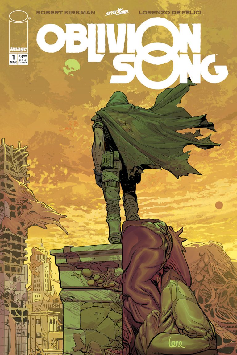
Thankfully, the rest of the assembled creative team does manage to make things more interesting and dynamic to further bolster the plot. Co-creator and artist Lorenzo de Felici does a great job of portraying tension in an early chase scene, with expressive characters throughout. De Felici creates a Philadelphia landscape that is simultaneously familiar and alien, with day-to-day objects like cars, signs, and fire hydrants peeking out from whatever strange organic matter has started overtaking everything. It is both grotesque and fascinating to look at.
Colorist Annalisa Leoni further enhances the landscape of Oblivion through her use of yellows, greens, and browns for the sickly looking Philadelphia. There’s an overgrown, dirty tinge to the apocalyptic city that doesn’t feel at all welcoming to humans – which can’t be said about the rest of the world. Leoni utilizes cooler blues and bright, clean colors once Nathan returns to the safety of the rest of humanity in a clear dichotomy.
Rus Wooton does some of the most interesting work on the issue with the lettering. The action-packed issue-opening sequence allows for plenty of bombastic sound effects that bring an added layer of anxiety to the events occurring. And let’s be honest, everyone’s a sucker for a great “TWAKOOM!”
The solid, if somewhat perfunctory, start to this series and that twist ending has piqued my interest enough that I’ll be sure to pick up the second issue to find out where things are headed. Fans of Kirkman will be pleased with this debut and the world that the creative team has designed, it’s both comfortably in his wheelhouse and something new.